Presenting the Whole Story
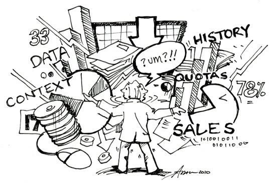
The quality and impact of data analysis is often judged by the end result (the “report”) and how easy it is to consume. This is unfortunate because it often means strong findings and conclusions are overlooked or otherwise missed because of writing, formatting or means of delivery problems … a common problem in business intelligence. Many data analysts struggle to take the data story and put it in both terms and formats that people can easily read and interpret … thereby making the report successful.
Unfortunately, analysts often don’t make the connection. Ask someone who is a really good analyst about aesthetics or the time and thought they put into “formatting” and you may get a variety of responses ranging from belligerence (“People should be able to read a report. The data is there.”) to quantitative humor (“Sure, I’ll make it easy to read; I’ll use a bar chart instead of a scatter plot .” *hysterical laughter). (Note: No one ever said quantitative humor was good … that’s why besides the great Steven Wright quantitative comedians just don’t work).
Automated Reporting
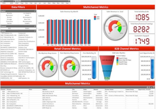
In the world of data analysis, dashboards serve the incredibly important function of providing a standardized venue for everyone to do what they do best. Designers and technical experts set it up and analysts populate it. It’s as simple as that. Dashboards come in a variety of shapes and sizes, but generally speaking, the keys to a good data view dashboard are:
• Multiple data views
• Easy to navigate
• Real-time, current data
• Highly customizable formatting, based on reader preference
It’s very difficult for a static, once-a-week report to be able to accomplish all (or even some) of those things. For many years, MarketStar left the ease-of-use of reporting up to analysts. Individual programs and analysts would get creative and produce various ways for our clients to easily interact with their program data. But individual efforts to create dashboards were incredibly inefficient and introduced quite a bit of variability in client experiences.
MarketStar has since developed a standardized proprietary dashboarding tool M*Sight that enables us to present our findings in an easily consumable format.

M*Sight provides our clients with real-time access to their program scorecards as well as competitive, sales and product data. The beauty of customization for our client is it allows them to see what they want (format), when they want (they can pull a report anytime, don’t have to wait for it), how they want (custom filters allow for easy drill-down based on interest). The beauty for our data analysts is that processes haven’t necessarily changed, we are looking at the same data and using the same analytical techniques, we are just able to show it in a more compelling fashion and that, by default, makes it better.
For more information on MarkeStar's business intelligence dashboarding, or to demo M*Sight contact Craig Jarman or Chris May.


